I think we all know that feeling when we walk into an older home and immediately shrink from the dated and sad aura it gives off.
I have found that unless there is a smell (sometimes there is,..) usually it is caused primarily by paint colors (or wood panelling, but that is a whole other topic.)
As many of us tend to shrink back at the colors from the 1950s-1960s it can be a bit tricky with midcentury homes to keep them modern but also authentic. Avocado kitchens and orange living rooms can be a truly frightening prospect!
So how do we solve this?
Like any other historic period we have to try to find colors that are somewhat period without being offensively so. Usually with midcentury this means a neutral with some pops of bright color.
(as a side note, paint colors will ALWAYS become outdated. They simply will. never fool yourself that some current trend will always be wanted or liked. This is why I recommend using paint or fabrics to add bright colors.)
So what colors worked 50 years ago? You name it! Midcentury design was very colorful, Let's look at some images and articles!

http://www.madformidcentury.com/2013/01/mid-century-modern-color-palette-trends.html#.VyKe3fkrLIU
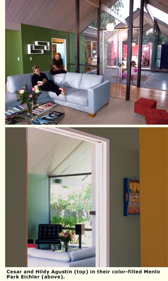
http://www.eichlernetwork.com/article/hues-say-you
http://abduzeedo.com/mid-century-modern-illustration-style

http://theglamoroushousewife.com/2013/09/home-decor-of-the-1950s/
/cdn0.vox-cdn.com/uploads/chorus_asset/file/4594689/HB1960covers.0.jpg)
Some of these colors are amazing, but the combinations can be a bit awful. So lets see some examples of modern fun usage without drowning in that dated feeling
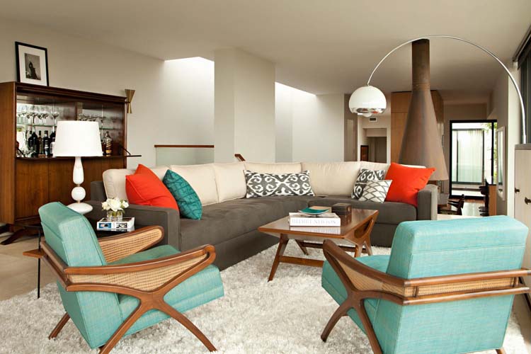
Much better isn't it?
http://www.zillow.com/blog/color-palettes-mid-century-modern-171154/


http://color.about.com/od/colorstyle/tp/Top-10-Colors-for-Mid-Century-Style.htm
No comments:
Post a Comment
Any comment on this blog can be removed by the moderator for any reason.